BBT Development: Level Design Part 2

To read Part 1 of our Level Design development post, click here.

Blog_LevelDesignerTags0003

Keeping Things Fresh While Creating a Monster

Kyle On Mechanics

One of the obstacles for designing levels in BattleBlock Theater was creating mechanics–which are interactive level sequences–to keep the game new and exciting. We always wanted there to be something new in the next level; something always keeping the player on their toes and saying, “Oh, wow! That was cool!” To do this, we would set a broad goal for the Campaign or level (e.g. “We want Campaign 4 to be boulder-centric“) and work around our ideas and layouts. This initial focused mindset would force us to use block types that we might have been underusing or create sequences with block combinations we would not have tried before.


kyle1

Creating new mechanics didn’t always happen organically while designing campaign levels though. Every level in the game didn’t go straight from brain to scrain… err, screen. Sometimes the idea would come to us while we were just playing through our already created levels; sometimes we would come up with something while messing around in the level editor. This created a fairly non-linear approach to our design process because we would come up with something really cool and then have to go back through the campaign, teach the mechanic, and expand upon it.


kyle2


Personally, I love creating new mechanics. Nothing brought me more joy in BattleBlock Theater than creating something that hadn’t been done before. From a superficial perspective, BattleBlock Theater only has a couple handfuls of block types to choose from, but, if you think about it, there are a little less than 38^1200 block combinations available in the game. I said think about it. Mind=Blown. ==^o.o^===k


kyle3


However, not all of our ideas came off the cuff. There were periods where I would lack inspiration and bang my head into my computer desk as if an idea might fall out (note to reader: it doesn’t work). Luckily, I devised some techniques to help through this process that can translate into any form of game/level design. Here they are (Keep them secret. Keep them safe):


1. Critical Analysis: This is what I call the process of going through everything we have—the existing sequences/combinations of blocks we already used—and figuring out what we have available. This was important to ensure a lack of redundancy. If I noticed there were no mechanics in the game that didn’t require you to use the wings with boulders, I’d take note and use that as inspiration to create a mechanic that did use that block combination. This process often had an overlap with my other techniques.


2. Building from a Base: This is where I would take an existing sequence or mechanic and I would expand upon it. This could be changing the focused mechanic to another block type (e.g. changing a saw on ice to a saw on gum blocks), turning the section into a CoOp sequence, or simplifying the existing mechanic to place earlier in the campaign. This led to a lot of playthroughs of the game to ensure we didn’t miss anything; the design process wasn’t always from the bottom up.


3. Getting Uncomfortable: When the previous two techniques weren’t enough or additional inspiration was needed, I would put myself into awkward scenarios to force myself to create something new. Often, this was sitting uncomfortably close to Ryan or standing on my head while trying to design. Most of the time, those didn’t work, so I would force myself to design in parameters that were extreme in verticality, opposite of our current norm, or a unique take on an existing process. This led to some very unique and fun level design which was critical to our design process.


This is just a fraction of my design process and each of us designers has our own techniques. With that said, I hope this gives you some insight on the design process of BattleBlock Theater and the brains that went into it. Some loser below me will now write some things. 😉

Blog_LevelDesignerTags0001

Hello! My name is Ryan Horn, and I’m a level designer.


Just like writer’s block or painter’s block (I think that’s a thing. If not, it should be), a level design block is plenty frustrating. Sometimes you don’t have any inspiration and nothing seems appealing; other times you have so much inspiration that it morphs into a mushy pile of tepid, indistinct ideas… which is even less appealing. Through many long and occasionally frustrating days in beautiful San Diego, I figured out a few techniques to help me take levels from their initial desolate desolation to the shiny and exciting completed levels that you find in BattleBlock Theater.


Before we really get started though, I have a little preface to throw in your face: In it’s end state, no level exists in a vacuum. When Billy is playing that level you poured your heart and soul into, it will always be sandwiched by other levels. Because of this, it’s very important to consider progression between levels when creating your creation.


Lay the Bones

It’s easier and more efficient for me to start big and work progressively smaller, so I’ll usually begin with brainstorming thumbnails of the player’s route through the level. Calling them thumbnails makes them sound far more developed than they actually are; they’re squiggles in a box, but they help form the skeleton of the level.


Don’t worry if you can’t decipher my chicken scratch thumbnails!

Once I pick a squiggle box I’ll bring it into the editor by roughly outlining the squiggle, then play with the shapes and spaces that start to emerge. I’ve found that beginning things this way helps me create a more interesting and varied level faster than if I were to pick a corner and start adding things from there. It also helps the level be more efficient in how space is used, and less wasted space from efficient design means more awesomeness can be fit into one level.

All this is done with the position of the level in the Chapter loosely in mind, as well as any Chapter-specific design goals. For example, Chapter 7 needed to have more level spanning puzzles, and Chapter 4 needed more boulders. For most of the Chapters this comes into play more when you get into the specific sequences, but it’s always a good thing to keep in mind.


Muscle the Skeleton

Once I have the skeleton of the level laid out, I move on to adding some muscle to it, i.e. actually adding gameplay sequences. I do this mostly off the cuff, and I’ll let myself be loosely guided by the spaces and shapes that emerged post-squiggle import. These spaces and shapes help structure and focus future sequences; staring at a blank space does not a good level make (Yoda – duh). It also helps tremendously to see how the entire level is structured. Seeing these larger relationships allows me to more easily create sections that interact in interesting ways, while at the same time ensuring that space is used efficiently.


Level_Partial

When creating more finalized gameplay sequences, Chapter positioning begins to come into play a lot more. I need to consider desired mechanics, difficulty, and any player lessons that need to be implemented or emphasized. These are mostly guided by where this awkward fleshy creation will go in the Chapter, as well as any other design goals already in place (level-spanning puzzles, etc). These considerations are also limited by the fact that the level is still a prototype; sections and levels will inevitably get moved around in the next stage to ensure the Chapter flows well. Difficulty is also something that will get finalized in the next step, but I at least have an idea of the desired difficulty and try to incorporate that when making a section.


Even with all the above flimflam floating around in my head, the primary design direction for specific sequences is determined by my own style, which boils down simply to creating player movement. Vertical, horizontal, teleporting, catapulted movement; it doesn’t matter so long as the player is moving. All that movement can get tiring though, so I also like to throw in some simpler puzzles to break things up. This foundational style is something that influences most of my levels, even with a larger design goal in place.


Flesh the Muscle

Contrary to what you might think, the final stage of polishing and tweaking often takes the longest to complete. You might think it’s safe to assume that you tie a pretty bow on the level and call it done, but you would be wrong.
This final stage requires numerous steps, the first (and most important) of which is positioning within the Chapter. This is primarily determined by difficulty relative to the other prototypes. Sometimes there’s a level that fits perfectly in a certain position except for one sequence, in which case we switch the sequence with one from another level. Other times a sequence is so great we want to expand on it, requiring changes to following sections and levels. During this step there are many small tweaks and changes aimed at achieving the desired sense of difficulty and progression through the level as well as the Chapter as a whole.

The second and most time consuming, but critical, step is playtesting both the level and the Chapter as a whole (because Billy doesn’t play a single level). This allows me to see where people might have problems that might have been overlooked and adjust things accordingly. I cannot overstate how important this step is. Playtesting your levels repeatedly with multiple people and making adjustments from what you learn is what will make your final levels feel smooth, clean and complete.

Now, I’m not suggesting you invite strangers into your house to playtest your levels like we did. That would be creepy and weird for both parties. Friends and family are good for feedback, and don’t be afraid to upload early versions online and get Forum feedback.


That about sums up my creation process and how I, mostly, avoid a level design block. I hope all my talking will help keep your creations fresh and exciting. The bottom line to keep in mind: have fun and playtest. If you have fun playing something, someone else probably will too. If you then playtest the heck out of it and make changes, many more people will enjoy your stuff. The End!

BBT Development: Level Design Part 1

Blog_LevelDesignerTags0002My name is Aaron Jungjohann and I was the lead level designer for BattleBlock Theater. I also have something shameful to admit:
 
The first time I sat down to play the game, I didn’t know what to make of it.


(The video above was our original trailer before the game was released and contains elements that are no longer in the released version of the game.)


The Progression Process

Now, keep in mind we’re talking about a very early build, played solo, with only a handful of blocks and none of the audio/video pizzaz that would come later. I knew that I loved the art direction and the platforming felt spot on, but I just couldn’t figure out what sort of platformer it was supposed to be. One moment I’m ricocheting off the walls, the next I’m turning triggers on and off in a teleporter maze or trying to counter cats with some surprisingly deep rock-paper-scissors style kung-fu. It was a lot to take in.
 
BBTLevelEditor
 
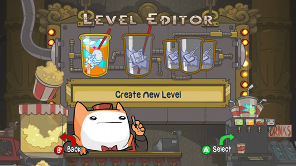
When they showed me the level editor I had my answer: BattleBlock Theater is just about any type of platformer you could want it to be. “Oh…” I said, and, “OHHH…” I said. After a few minutes of mixing this block with that block to trigger THOSE blocks, I was hooked.
 
Yet, even then I’d underestimated how much depth was contained within Battleblock Theater’s deceptively simple mechanics; 3 years and hundreds of levels later, I am STILL being surprised by what my team and the player community are capable of building out of only a couple dozen block types.
 
And while all of this potential is “A Very Good Thing”, I learned that the game’s depth could quickly transform itself into frustrating complexity unless we were very careful about how we exposed players to the game’s many “block mechanics”.
 
So, getting down to business, I’m going to break down a couple of the ways we used level design to help players teach themselves about BattleBlock Theater’s many perils and possibilities.

Blocking it all Out

Right out the gate, one of the first things I did when attempting to plan out the 8 Chapters of Story Mode was separate all of the game’s block mechanics into 3 groups, in order of complexity:
 
–Static Blocks with passive reactions to the player (things like Lava Blocks, Explosive Blocks and Cloud Blocks).
 
–Interactive Blocks that players can manipulate (Moveable Blocks, Fan Blocks, Boulders).
 
–“Automated” block mechanics that trigger other Blocks (Bridges+Lasers, Triggers+Lifts and Triggers+Triggered Blocks).
 
To learn how the first group operates, players simply needed to touch them. That said, one of our favorite Blocks in this group, the Lava Block, is also one of the deadliest looking. And while I suppose giving the Lava Block a safer, bouncier make-over was always an option, where’s the fun in that? Instead, to help players along, I designed a portion of the first level of Chapter 1 so that it would hopefully trick players into their very first bounce. Luckily for me, it was also a perfect opportunity to teach 2 other Blocks in the group: the Explosive Block and the Cloud Block.
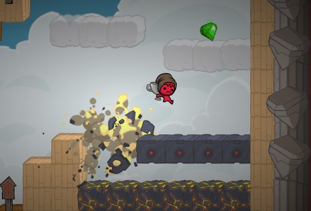
 

Featured blocks in this screenshot are the clouds, explosive blocks and lava blocks.


Seeing the Gem, most players run out and make a jump for it. Having never seen an Explosive Block before, they usually have no idea that its about to disappear out from under them. A few moments later and they’ve fallen down onto the Lava Blocks before bouncing up through the Cloud Blocks, panicky, but wiser.
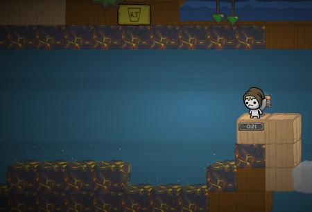
 

Screen2
Forced to jump onto lava blocks. How cruel!


Still, in order for all of that info to really stick we made sure to include similar “lessons” at least twice more, which is why you see this impossible to bypass room of Lava Blocks in 1-3. And besides, who doesn’t like bounce houses?
 
The second group of Blocks are a bit trickier, as they force the player to actively manipulate them. The first Moveable Block is found in Chapter 2, and is one of the few instances where we rely on an on-screen indicator. Because it is very important that players understand the ways the Moveable Block can be manipulated, we first force you to push it, and then later pull it to make progress.
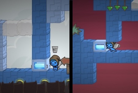
 

Screen3
Move those blocks, Prisoner!


A bit trickier was conveying the Moveable Block’s ability to hang in the air; many players were still confused even after the appearance of the block had been revised to make it appear hollow. We tried placing a few Moveable Blocks floating in the air here and there, but in the end players really just needed to place it there themselves.
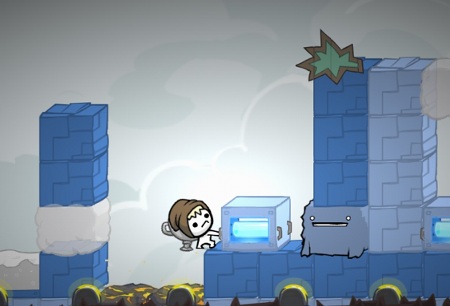
 

Trapped the fuzzy Ferdinand!


To help nudge players along, this sequence was added, requiring players to get the Moveable Block out of the Ferdinand’s path (that would be our fuzzy friend with the smile). Players must jump with the Block to accomplish this, and by including a patch of Lava Blocks behind them, we found that players were even more likely to bounce up and drop the Moveable Block while in the air.
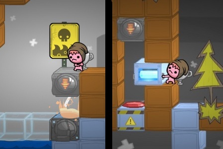
 

Screen5
“Automated” trigger blocks


Finally, there was the last -and potentially most frustrating- group: the “automated” block mechanics. Because these required players to react to THEIR timing rather than let players set their own pace, it could be especially frustrating for those who didn’t understand how they worked. With this in mind, Chapter 5 opens with a safe spot that allows players to observe a Laser Block firing directly at a Bridge Block, and this bit of automation is reinforced a bit later by forcing players to recreate a similar interaction themselves.
 
As we’d learned with the Moveable block, by creating this chain reaction themselves, players were better prepared to quickly anticipate the role these blocks could play in hazardous or puzzling situations later on. And speaking of hazardous situations…


Welcome to the Danger Zones


Another way I tried to smooth out the learning curve was to limit which areas of the level were dangerous to the player. In Chapter 1, the primary threat early on is Water Blocks, an unmoving threat that is only on the floor; players have to be careful about what’s below them, but the area ahead and above is hazard free (if not Cat-free).
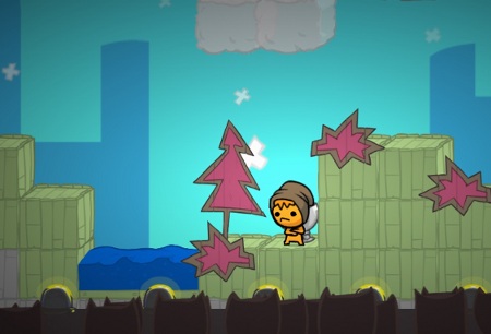
 

FACT: Prisoners cannot walk on water.


Near the end of the Chapter 1, players encounter their very first Laser Block. Placed vertically, the Lasers help players feel especially motivated about considering a larger part of the area in front of them.
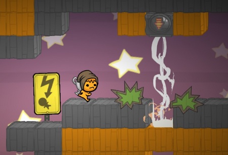
 

Running from danger can be a motivation in life, or at least in BBT.


In Chapter 2, players begin to notice that Spike Blocks are now popping out here and there along the walls and ceilings, adding a new dimension to their troubles.
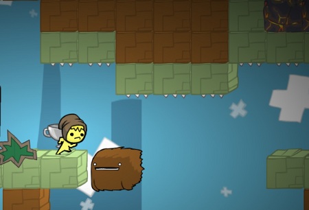
 

Look out for those spiky things, what do they call 'em? Oh yeah, spikes.
Look out for those spiky things, what do they call ’em? Oh yeah, spikes.


And finally, this difficulty curve steepens in Chapter 3 to include hazards with more complex and unpredictable patterns like the Cannon and the Rocket Bot, forcing players to adapt to threats from all angles, albeit first with Wings at their disposal and then eventually without any help at all in Chapters 5 & 6.
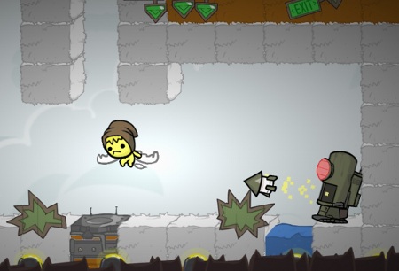
 

Screen9
Rocket Bots that target you are one of the deadliest hazards in the levels.


And there you have it: some behind the curtain bits about progression in BattleBlock Theater’s Story mode. Of course, planning and good intentions can only go so far, and it was only through an amazingly helpful army of playtesters (both internally and at tradeshows) that we were able to sand off some of the REALLY sharp corners. Thanks to all of you who were drowned, impaled, exploded, electrocuted, eaten, melted and shredded: we couldn’t have done it without you.


Read Part 2 of Level Design by Kyle and Ryan! Click here.